|
Equal Voter Democratic World Democracy is generally used for a broad range of electoral systems. The term used here describes only that form of democracy that delivers Equal Representation. Voters then not only pick their own candidates but the representatives also represent then all voters' positions. It may come as a surprise, but very few nations in the world have a democracy based on representing each voter's position. On the map below, the few nations in our world delivering Equal Representation are shown. Nations with the pure winner-takes-all system do not fall under this specific banner, because on average some 40% of the voters do not receive actual representation in district voting. The following map of the world shows three varying degrees of equal representation in the world. The primary level in dark green shows the few nations that make the voters' choice be the only vote that matters, and have each vote directly translated into representatives. As you can see, the majority of these nations are found in Europe (but not exclusively; also note, not UK, not France, not Russia).
Sources used to compile this graph based on 2005 data from: CIA World Factbook, Worldpolicy.org, NationMaster.com , and WPmap. Disclaimer: Not all nations may deliver in reality what on paper is their official governmental format. Also, recent political changes, such as occurred in the Middle-East are not shown. The secondary level of equal representation is taken up by those nations that have proportional elections but additionally have presidential elections. They are shown in lighter green. Presidential elections are not proportional elections: They are an addition to a democracy which in itself is a winner-take-all election. Together this forms a specific mix of proportional plus district elections. Central-American, South-American and African nations tend to have this form of democracy — if they have proportional representation. The third level of equal representation is taken in by those nations with a peculiar use of proportionality: People vote for their representatives in districts, but some importance to equal representation is then delivered in the result as well. If a nation votes in districts and the districts have not one but several seats per district — or when the end results of all districts are adjusted afterwards to include the overall vote as well — then such nation is shown in blue. Important nations in this category are: Germany, Japan, Australia. Here is the visual once more:
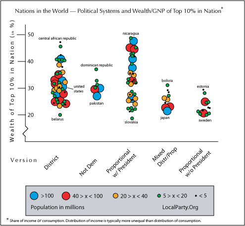
Distribution outcomes Data collection varies per nation, but the following graph does indicate how much the top ten percent in a nation receives of the income ór of the consumption in a country. Five versions of government are set apart, and the three versions of equal representation are shown to the right. Important aspect to notice is the white space found in the graph above the two specific forms of government with proportional representation to the right, and how this differs from the version with an empowered president. In the graph, each dot represents a nation, and the color and size declares how large a nation is, population wise. The 50 percent marker to the left indicates half of a nation's income or consumption going to the top ten percent of people in that nation. Nicaragua, for instance, is one of the countries where the top receives close to half the nation's income or consumption.
Source: NationMaster.com Please note that the distribution of consumption usually shows a lower level of inequality than the distribution of income. Various aspects on this graph may therefore be further skewed than they already appear. The difference found between two forms of proportional elections — one with a president (shown in the middle) and one without a president (shown to the far right) is stunning. These two forms of proportional representation show almost opposite results. Nations with proportional elections without a president all remain below the level as found in the United States, while nations with proportional elections that also elect a president show many above that level. Nations with winner-take-all (district elections) also show a great variety in outcomes, but they group at a higher average of income or consumption going to the top than the two forms of equal representation to the far right. Please note that many district-elected nations have an empowered president, too, but not all. The distinction is not made for district elected nations in this graph, because all representatives are selected in the same way; having a president just adds a layer. The next graph looks at the ten percent of the population that find themselves at the economic bottom side of their nations. Please note that the graph has a single percent marker on the left side instead of a ten percent marker. The 5 percent marker to the left indicates one-twentieth of a nation's income or consumption. The people belonging to the bottom ten percent in Japan, for instance, are shown to receive one-twentieth of this nation's income or consumption.
Many nations in top and bottom position of the two graphs on distribution appear in opposite places. This follows common logic: where the rich get a lot, the poor tend to get a little; where the rich share more, the poor also receive a relatively larger share. The two graphs become interesting when for instance a nation does not swap rich and poor positions in the expected manner. Note, for instance, how the top ten percent of society in the United States make this a rather average nation in the world in light of sharing wealth (close to 30% goes to the top, which is a lot, but not to an extreme extent). Meanwhile, the bottom ten percent of society in the United States rank among the lowest in the world of people sharing a nation's wealth. Taking both graphs into consideration, the trend would be more standard if the US poor had received about 2.5 to 3.0 percent of the nation's wealth. But according to the source used for all this data, the bottom in the US received about 1.8 percent. Said in the same way, but then for the first graph, the US would be more in line if the top ten percent was shown to have 40 percent of income or consumption instead of the shown 30 percent. Sometimes important data is not comparable among nations, for instance, about the population living below poverty level. The international standard for poverty is expressed as anyone living below half of what is considered a nation's median income (what the person in the middle earns), but few nations use this standard. The European Union uses not 50 percent, but 60 percent of the median income as the definition for the level of poverty. The United States basically multiplies by three the food needs for a family to get its definition, which comes down to about 40 percent of the median income as the definition for the level of poverty. You may have seen how the US and Western European nations are often considered to have similar levels of poverty. But the definitions are not based on the same calculations. The next graph does show the poverty level in one and the same way, using the international standard for poverty
Data confirms that smart voting systems promoting equal representation deliver a more equal distribution of wealth. The poor are still the poor in the better democracies of the world. And the rich are still the rich. But rich and poor share better in nations with equal representation. Clearly, the poor in 'democratic' nations with winner-takes-all are missing out on their chance of pursuing happiness. They are simply not represented in any significant manner at the table of decision makers. Still having trouble understanding it all, politically? Then you will like the Visual Displays for sure.
|